Did you know that your house can tell a lot about you? And did you know that there is a branch of the psychology that studies the colours? These are so important in our lives that, according to recent studies, even our appetite can vary depending on the colour of our plate.
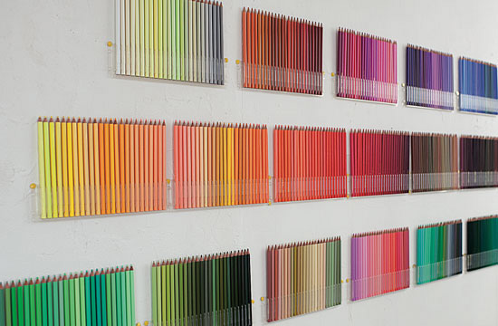
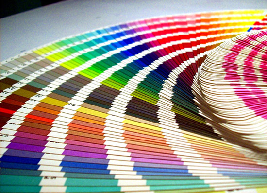 The colours of our house have influence over our mood and they can reveal our personality; they can provide us with a more relaxing sleeping or, on the other side, make us start the day with the wrong foot; they can make us focus better while studying and also give us the necessary strength to face a hard day. The colours we choose to paint our house can also modify the perception we have of the spaces, making them appear bigger or smaller and darker or brighter than they really are. Ral or Pantone colour charts can help us choose the colours we like the most but, which ones would be the right ones?
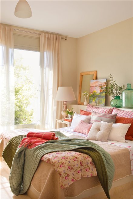 – Red is the colour of the impulses and it can alter our nervous system on a good or a bad mode, and in this last case it could make us be confused, which is why is not recommended to paint the walls of a bedroom in red. It is nevertheless recommended to paint them in colour originated from pink and orange, especially if we are talking about the master bedroom, for the reason that they bring to mind the idea of union and team work, and they are associated with love and affection.
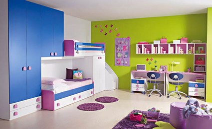
– Even though it is considered the cool colour par exellence, blue can reflect over us relaxing feelings, lead us to sleep or open our minds, but as all the other colours, an overdose could make a room look too sad. It is recommended to use strong blue colour schemes, like navy blue, to decorate the children´s playroom. For a bedroom turquoise, sky-blue or bright blue would be perfect, trying always to avoid pastel tones in spaces with little light where they could cool down the atmosphere.
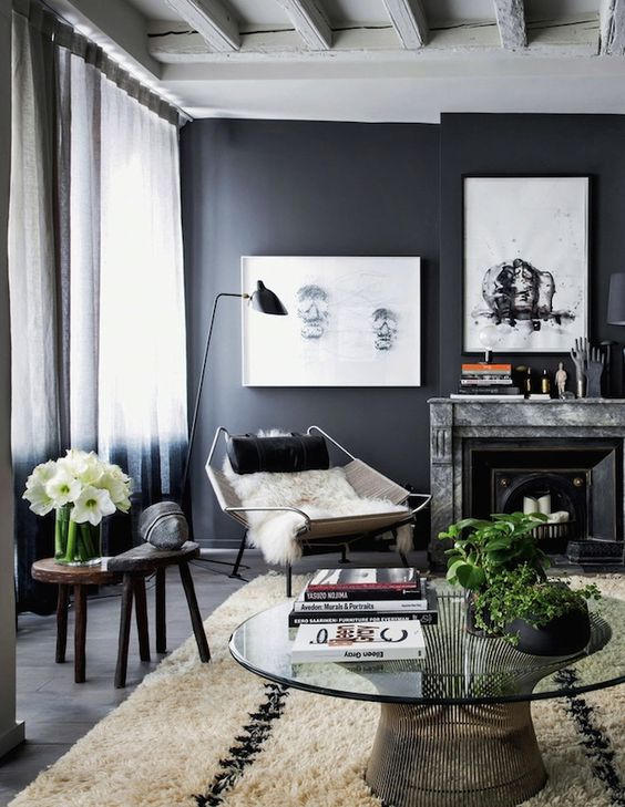
 – Green is the representation of nature, it stimulates the creativity and is recommended for studying or working places. Neutral colours are a trend these days, so you would hit the target with an olive or a sage green.
– Yellow represents optimism and joy, but such as red, the excitement too and it is not right for the laying areas of our house. Its strength is its ability to make a room look bigger and more welcoming, being due to this ideal for living rooms and small sized bedrooms. It´s one of the colours with less followers and most overlooked, and its use is not advisable for public spaces. It is good instead to use for these spaces orange tones that will send the message that a store or an office offers quality products at a good price.
 – Black reflects the pessimism but it is, at the same time, very elegant and, in combination with other colours, it may be a wise decision. We will have to be careful with it because it is also a colour that captures the light and it could make a room look smaller. White, however, symbolizes purity and cleanliness; it can be used to paint any of the spaces of a house and, like the yellow, it visually expands the space.
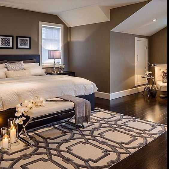 – Brown is the emblem of the neutral colours. it´s the colour of warmth, security and comfort, and its darker shades blend perfectly with other brighter colours.
In the case that we would still want to paint a bedroom with a dark strong tone, we could chose to paint with it the wall that receives less light, a wall that is out of our visual angle while in bed, as it could be the wall above which the headboard is set.
Aside from the basic colours, we all know, we also must take in consideration their tonalities and what those transmit us. An area with pastel colours, with their sweetness, will transmit us serenity feelings and harmony. It is suggested to decorate the babies rooms with these colours that will allow them to sleep peacefully. Sky-blue, navy blue, ochre, salmon, gray, lavender, ivory or pale pink are your colours if you are looking for an eternal spring.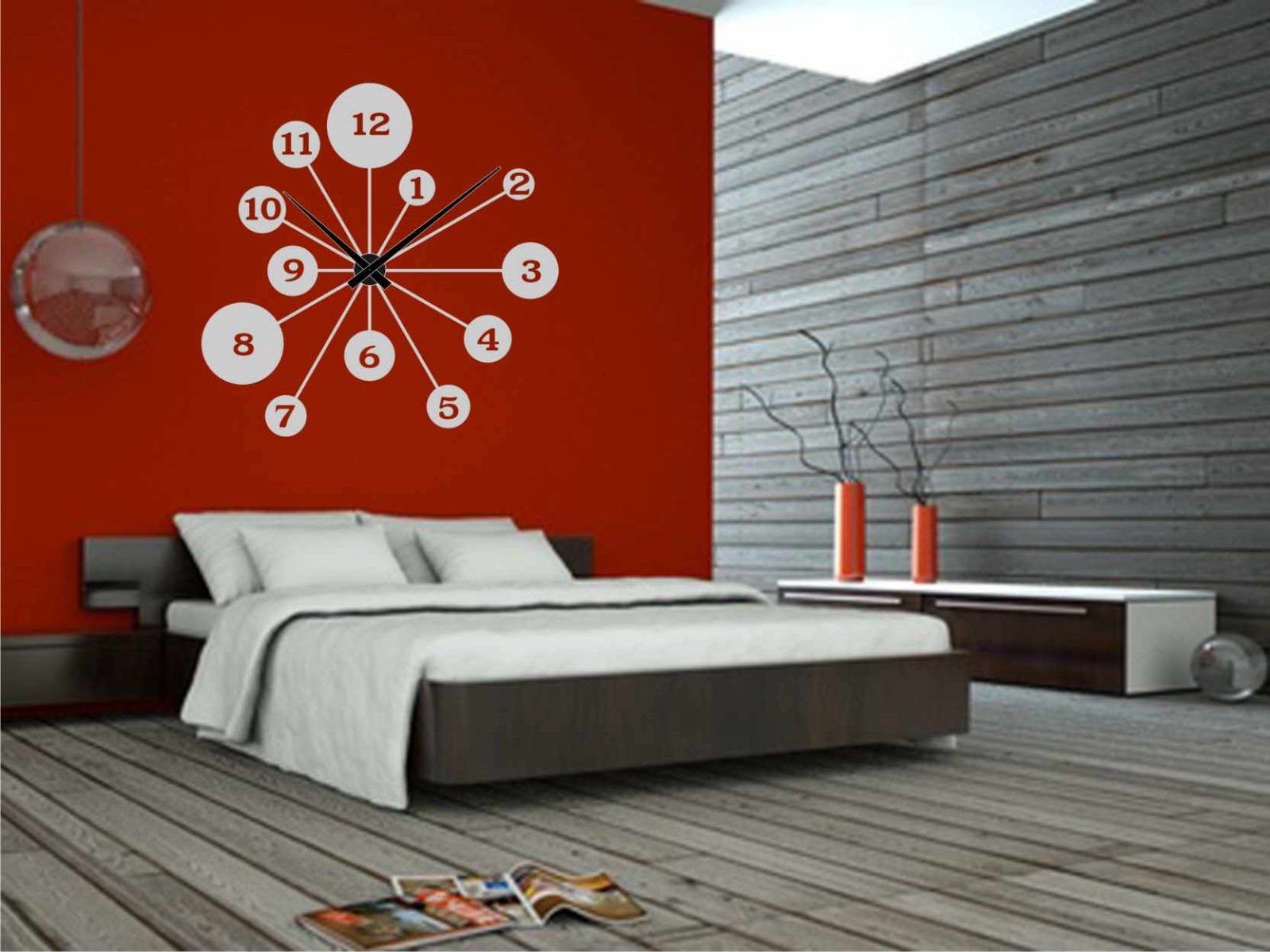
If we want a room to look taller, we can make it by painting the ceiling with a lighter colour than the walls or the other way round if it is a room with high ceilings. To extend a space we could use wallpapers as a visually sophisticated idea or we could simply paint in a lighter colour the bottom wall.
And if what we desire is to paint a large room or an open area of the house, we can use different colours at our mercy eliminating this way chromatic monotony, generating depth and creating the sensation of division between the different areas. 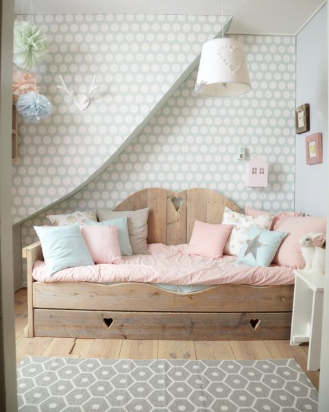 For example, an open concept kitchen can be separated from the living room and the dining area with different colour lines, walls or even floors. Kids will love the colour blend so we could also apply this to their rooms making the playground look different from the studying and resting area.
At our company, we are experts at making you feel the kings of the house, creating confortable and useful houses, but above all, homes where you como back with love, so if the walls of your house turn your hair grey and what you want is to see everything through rose coloured glasses, don´t hesitate to contact us.


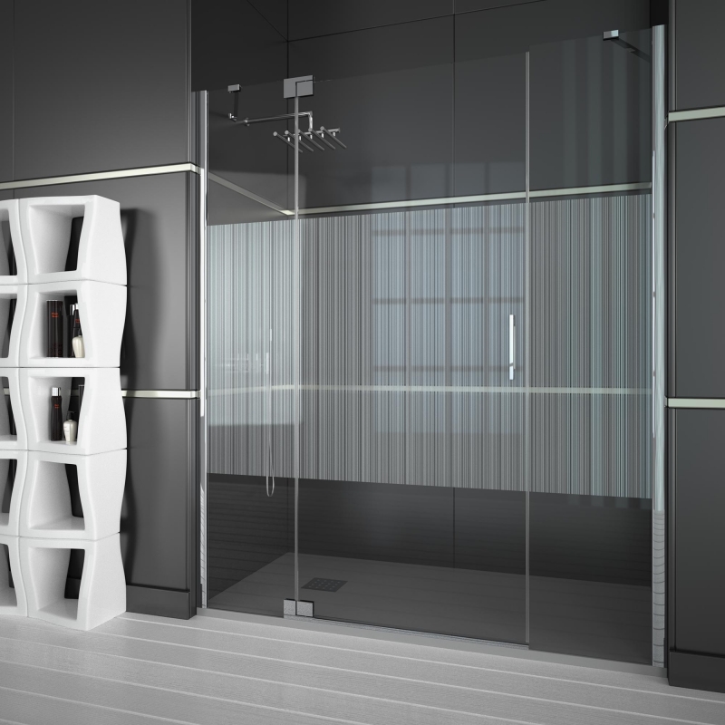

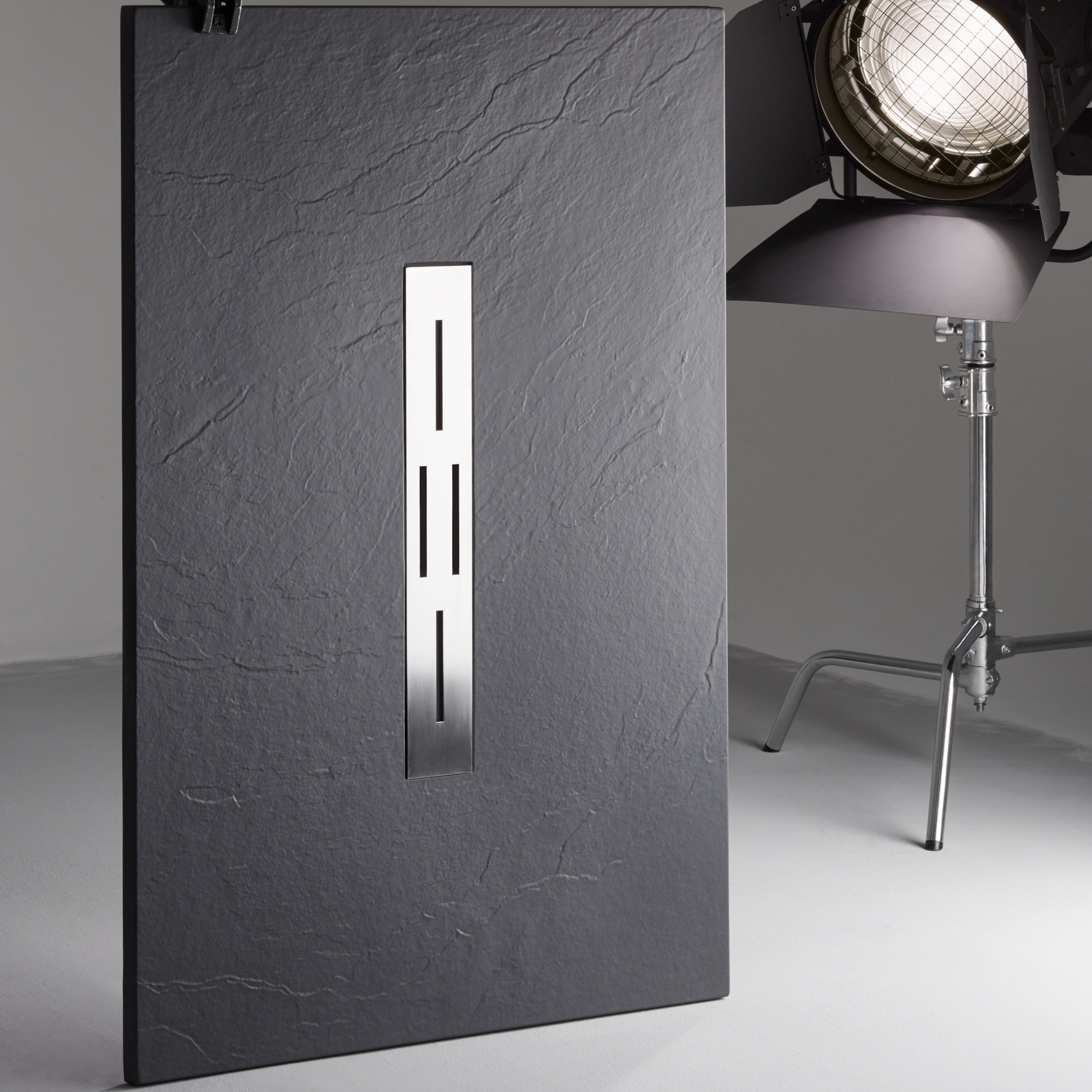
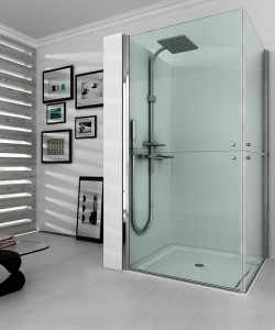 – In case we may have a disabled person living with us, replacing the bath tub may be the best option for their confort and security. The new shower trays and screens can be equipped with anti-slip support bars allowing them to have a greater degree of independence and autonomy.
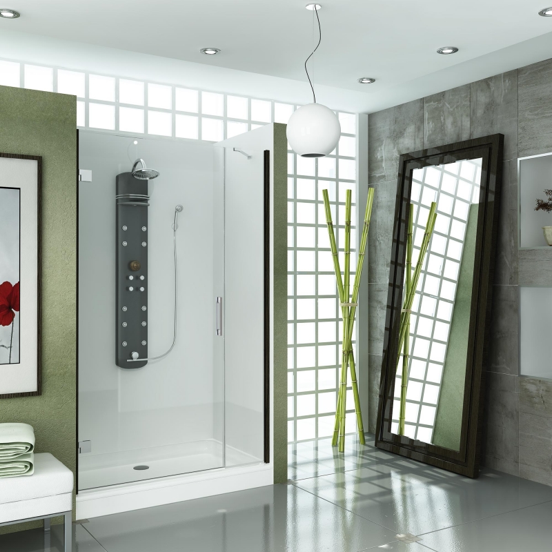


Recent Comments